Western Fall Color Palette
This color palette feels warm and cozy with its muted green, soft beige, dusty blue, rich terracotta, and deep mauve. It gives off a beautifully balanced vibe that feels grounded but still has plenty of personality.
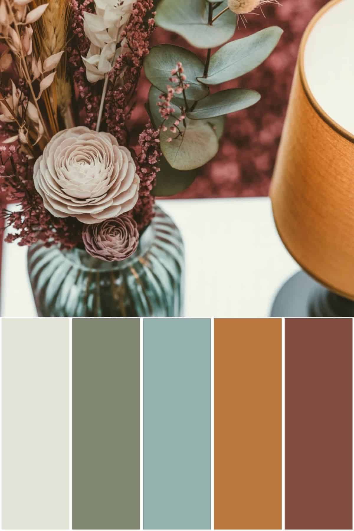
If you’re looking for fall color inspiration that feels cozy, balanced, and a little earthy, this palette might be just what you need. The soft green and blue tones bring a calming feel, while the terracotta and mauve add just the right depth and warmth. It’s a pretty mix for creating cozy spaces that feel relaxed and well-loved.
Have you ever wondered what your home decor style is?
The color hex codes and the Benjamin Moore paint color matches are included below to make it easy to bring this look to life in your own home.
You can save any of these images to your Pinterest account using the Pinterest share buttons on this page to easily find them again later!
What Colors Go Well With This Palette?
This color palette already has a really cozy, balanced feel, but you can definitely pair it with other colors to mix things up.
Soft creams, warm whites, and even deep charcoal grays work well as neutrals alongside these shades. If you want to add more pop, I recommend muted blush pinks, mustard yellows, or deeper greens.
These colors can fit in beautifully and help keep things grounded while adding a little personality.
How to Implement These Colors In Your Home
Bringing these colors into your home can be fun and straightforward. You could start with paint—maybe using the soft green or the muted blue on walls for a calm, easy-going vibe.
The warm terracotta and deep mauve would look gorgeous in smaller accents like throw pillows, rugs, or wall art.
I also love the idea of using natural materials like wood, rattan, or linen to tie it all together. You don’t have to change everything at once—just adding a few pieces in these colors can really make your space feel cozy and fresh.

Western Fall Color Palette Hex Codes
Color hex codes are hexadecimal representations of colors used primarily in web design and digital graphics.
They consist of six characters, ranging from 0 to 9 and A to F, representing the intensity of red, green, and blue (RGB) components, respectively.
Hex codes allow designers to specify colors precisely, ensuring consistency across various digital platforms and achieving the desired aesthetic.
These codes can be used in HTML, CSS, and graphic design software, providing a universal language for color communication in the digital realm.
The hex codes for this color palette are:
- #E2E3D7
- #7F8770
- #95B1AE
- #BB7940
- #814C3E
Western Fall Benjamin Moore Paint Colors

If you love these colors and want to use any of them as paint colors in your home, I have included the Benjamin Moore paint color matches.
On the Benjamin Moore website, you can order samples of their paint colors in a half-pint size, a 4″x8″ color swatch, or as a peel-and-stick paint sample.
The Benjamin Moore paint colors for this palette are:
- White River
- Jojoba
- Kensington Green
- English Ochre
- Boston Brick
This is an affiliate link.

Conclusion
I love how these colors work together to create a unique, cozy, lived-in feel for fall that still feels stylish.
Whether you’re thinking about painting a room or just pulling together some decor pieces, this palette has plenty of room to make it your own. I hope you find some ideas here that feel just right for your space!
If you want to find this color combination again, save it to your Pinterest account using the buttons at the top and bottom of this post.
Before you go, be sure to check out my other color palettes.


Before buying furniture, get this free checklist!
The measurements, sizing rules, and 10 must-ask questions that save you from returns, regrets, and wasted money.