Neutral and Terracotta Living Room Color Palette
This post is all about my terracotta color palette.

I am completely in love with how grounded and cozy this color palette feels. The mix of soft cream, warm beige, and that rich terracotta creates such a welcoming space. It reminds me of a slow Sunday morning, cuddled up on the couch with my coffee and a book.
Have you ever wondered what your home decor style is?
The color hex codes and the Benjamin Moore paint color matches are included below to make it easy to bring this look to life in your own home.
You can save any of these images to your Pinterest account using the Pinterest share buttons on this page to easily find them again later!
Terracotta Color Palette
First, let’s talk about what interior design style works well with this color palette and how to implement these colors in your home. Then, we’ll go over the matching hex codes and paint colors.
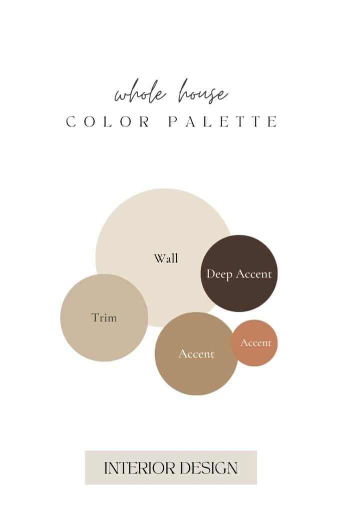
What Design Style Works Well With This Palette?
This color palette is a match made in heaven for Organic Modern and Warm Minimalist design styles.
Because the tones are so deeply rooted in nature, they naturally complement the clean lines and raw textures that define these looks.
It also works well for a Japandi aesthetic, where the focus is on simplicity, comfort, and a connection to the earth.
The beauty of these shades is that they don’t fight for attention. The cream and sandy beige tones create a quiet, peaceful backdrop, while the deep clay and rich espresso add depth. It’s all about creating a space that feels curated yet incredibly relaxed.
How to Implement These Colors In Your Home
The easiest way to start using this color palette is to layer textures rather than focus solely on paint.
Think about a cozy bouclé
Use the deep brown tone for your smaller accents, like picture frames, hardware, or lighting fixtures, to anchor the entire room.
Wood tones and natural materials like travertine or stone also work nicely here, mimicking the exact textures in the inspiration photo. Keep the walls light with cream or soft beige, and let the warmer, darker tones bring in the cozy character.
Terracotta Color Palette Hex Codes
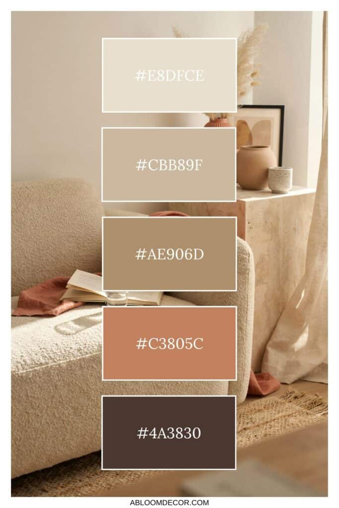
Color hex codes are hexadecimal representations of colors used primarily in web design and digital graphics.
They consist of six characters, ranging from 0 to 9 and A to F, representing the intensity of red, green, and blue (RGB) components, respectively.
Hex codes allow designers to specify colors precisely, ensuring consistency across various digital platforms and achieving the desired aesthetic.
These codes can be used in HTML, CSS, and graphic design software, providing a universal language for color communication in the digital realm.
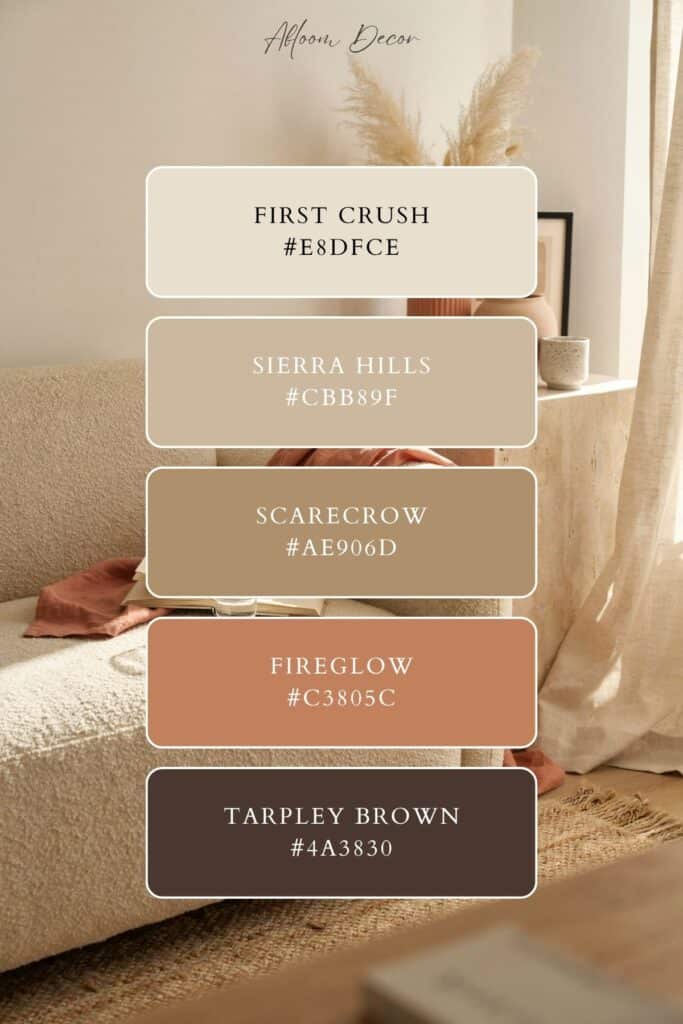
The hex codes for this color palette are:
- #E8DFCE
- #CBB89F
- #AE906D
- #C3805C
- #4A3830
Benjamin Moore Paint Colors
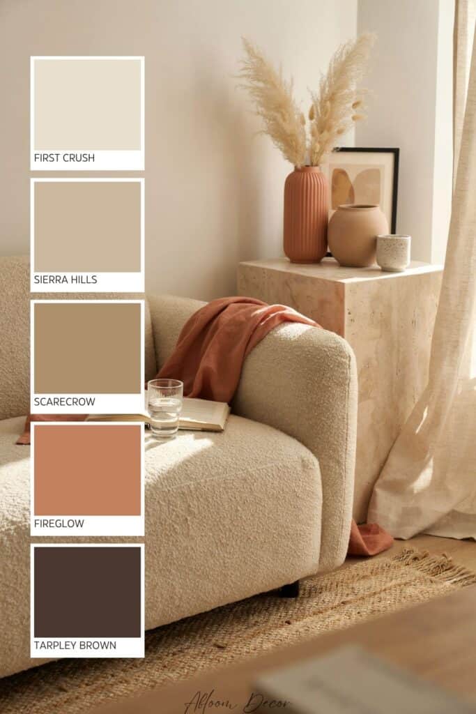
If you love these colors and want to use any of them as paint colors in your home, I have included the Benjamin Moore paint color matches.
On the Benjamin Moore website, you can order samples of their paint colors in a half-pint size, a 4″x8″ color swatch, or as a peel-and-stick paint sample. On the Samplize website, you can order full 8.5″x11″ peel-and-stick paint samples.
The Benjamin Moore paint colors for this palette are:
- First Crush
- Sierra Hills
- Scarecrow
- Fireglow
- Tarpley Brown
This is an affiliate link.
Similar Posts You’ll want to see
Conclusion
Bringing these warm tones into your space is such an easy way to create a cozy, inviting mood. Whether you start small with a few linen pillows or go all in with a fresh coat of paint, you really can’t go wrong with these earthy shades.
PIN IT TO REMEMBER IT
Don’t forget to pin this so you can refer back to it later!

Before buying furniture, get this free checklist!
The measurements, sizing rules, and 10 must-ask questions that save you from returns, regrets, and wasted money.