Orange Color Combo That Makes Neutrals Feel Anything but Boring
This orange color combo pairs warm earthy tones with soft neutrals, featuring Benjamin Moore paint color matches and hex codes.
I’ve always loved warm colors, but orange took me a while to fully appreciate. I used to worry it would feel too bold or overpowering, especially in everyday spaces like the living room. I put this together to show how orange can feel soft, welcoming, and surprisingly easy to live with when it’s paired with the right neutrals.
Have you ever wondered what your home decor style is?
The color hex codes and the Benjamin Moore paint color matches are included below to make it easy to bring this look to life in your own home.
You can save any of these images to your Pinterest account using the Pinterest share buttons on this page to easily find them again later!
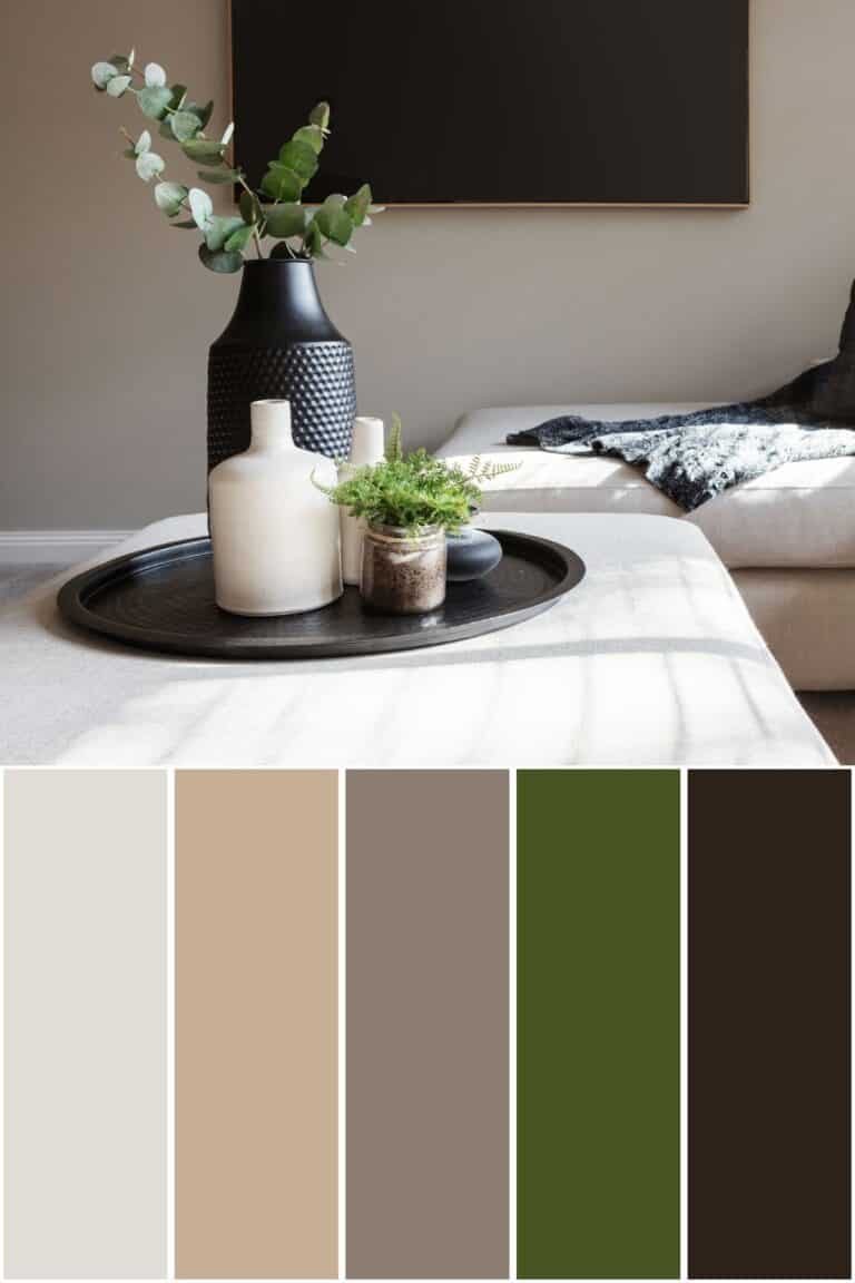
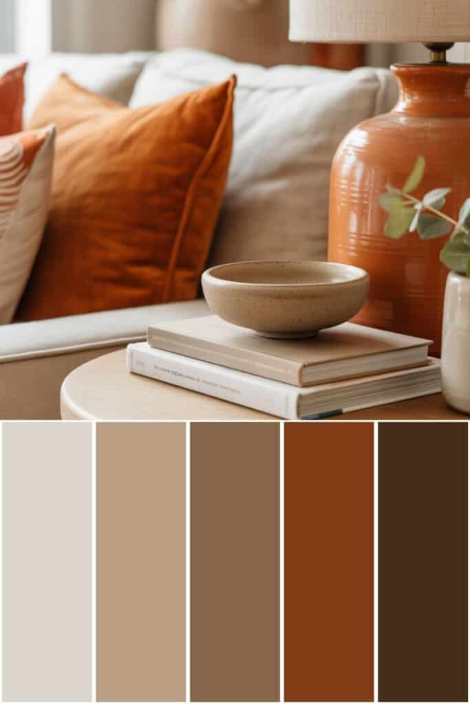
Orange Color Palette
First, let’s talk about what interior design style works well with this color palette and how to implement these colors in your home. Then, we’ll go over the matching hex codes and paint colors.

What Design Style Works Well With This Palette?
This color palette works especially well with organic modern, warm transitional, and earthy traditional homes.
The mix of Balboa Mist and Dark Buff keeps everything feeling light and calm, while Rustique and Bucktrout Brown add that rich warmth that makes a space feel finished.
Blue Ridge Mountains brings in a deeper neutral that balances the orange tones beautifully. These styles shine because they rely on texture, natural materials, and warmth — exactly what this palette supports.
How to Implement These Colors In Your Home
I like to think of Balboa Mist and Dark Buff as the quiet foundation of this color palette — perfect for walls, larger furniture, or rugs.
Rustique works beautifully as an accent in lamps, pillows, pottery, or artwork, where you want warmth without commitment.
Blue Ridge Mountains and Bucktrout Brown are great for grounding a space through furniture, wood tones, or even a painted door or built-in.
When these colors are layered together, the home feels cozy, intentional, and pulled together without feeling heavy.
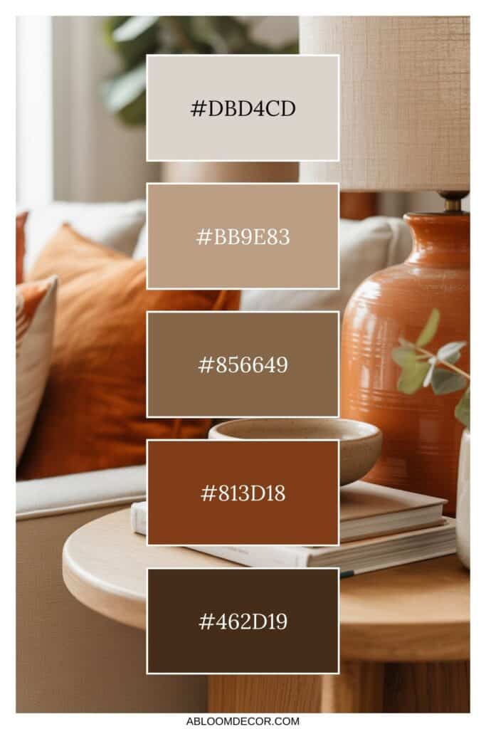
Orange Color Palette Hex Codes
Color hex codes are hexadecimal representations of colors used primarily in web design and digital graphics.
They consist of six characters, ranging from 0 to 9 and A to F, representing the intensity of red, green, and blue (RGB) components, respectively.
Hex codes allow designers to specify colors precisely, ensuring consistency across various digital platforms and achieving the desired aesthetic.
These codes can be used in HTML, CSS, and graphic design software, providing a universal language for color communication in the digital realm.
The hex codes for this color palette are:
- #dbd4cd
- #bb9e83
- #856649
- #813d18
- #462d19
Benjamin Moore Paint Colors

If you love these colors and want to use any of them as paint colors in your home, I have included the Benjamin Moore paint color matches.
On the Benjamin Moore website, you can order samples of their paint colors in a half-pint size, a 4″x8″ color swatch, or as a peel-and-stick paint sample. On the Samplize website, you can order full 8.5″x11″ peel-and-stick paint samples.
The Benjamin Moore paint colors for this palette are:
- Balboa Mist
- Dark Buff
- Blue Ridge Mountains
- Rustique
- Bucktrout Brown
This is an affiliate link.
Similar Posts You’ll want to see
Conclusion
What I love most about this color palette is how comforting it feels the moment you see it.
The orange tones add warmth, but the soft neutrals keep everything calm and balanced. It’s the kind of palette that works just as well in a living room as it does in a bedroom or entryway.
It proves that orange can feel cozy, classic, and completely livable.
PIN IT TO REMEMBER IT
Don’t forget to pin this so you can refer back to it later!


Before buying furniture, get this free checklist!
The measurements, sizing rules, and 10 must-ask questions that save you from returns, regrets, and wasted money.