Pastel Blue Kitchen Color Scheme You’ll Love Every Day
This pastel blue kitchen color scheme features coordinating Benjamin Moore paint colors and hex codes for a warm, timeless kitchen.
I’ve always loved pastel blue in a kitchen, but sometimes it can be a challenge to make it feel warm rather than chilly. That’s exactly why I put this color palette together. The mix of soft blue with gentle grays, creamy whites, and warm golden tones creates a kitchen that feels calm and welcoming. I wanted to share this palette for anyone who loves pastel blue but wants it to feel cozy and livable.
Have you ever wondered what your home decor style is?
The color hex codes and the Benjamin Moore paint color matches are included below to make it easy to bring this look to life in your own home.
You can save any of these images to your Pinterest account using the Pinterest share buttons on this page to easily find them again later!
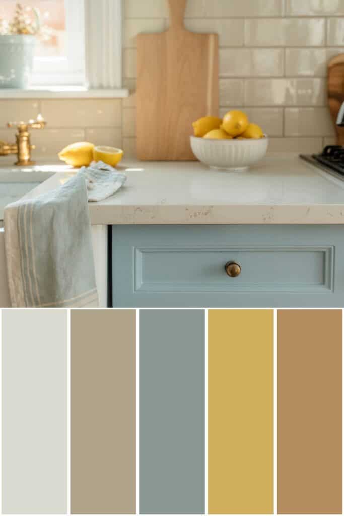
Pastel Blue Color Palette
First, let’s talk about what interior design style works well with this color palette and how to implement these colors in your home. Then, we’ll go over the matching hex codes and paint colors.

What Design Style Works Well With This Palette?
This pastel blue kitchen color palette works especially well with classic cottage, soft traditional, and relaxed coastal styles.
Brewster Gray and Meditation help ground the pastel blue so it doesn’t feel too sweet, while Titanium keeps everything light and clean.
Maple Syrup adds warmth through wood tones, which is key for balancing cool colors in a kitchen. Hollywood Gold is perfect for hardware and lighting, bringing in just enough warmth and polish without overpowering the space.
How to Implement These Colors In Your Home
Use the pastel blue shade on cabinetry or an island to anchor the space and set the tone.
Keep walls, backsplash, and countertops light with Titanium so the kitchen feels bright and open.
Bring in Maple Syrup through cutting boards, open shelving, or stools to warm things up visually.
Finish with Hollywood Gold hardware or fixtures for a soft glow that ties the whole color scheme together beautifully.
Pastel Blue Color Palette Hex Codes

Color hex codes are hexadecimal representations of colors used primarily in web design and digital graphics.
They consist of six characters, ranging from 0 to 9 and A to F, representing the intensity of red, green, and blue (RGB) components, respectively.
Hex codes allow designers to specify colors precisely, ensuring consistency across various digital platforms and achieving the desired aesthetic.
These codes can be used in HTML, CSS, and graphic design software, providing a universal language for color communication in the digital realm.
The hex codes for this color palette are:
- #dbdad0
- #afa38a
- #8a9793
- #d2ae5b
- #b78d61
Benjamin Moore Paint Colors

If you love these colors and want to use any of them as paint colors in your home, I have included the Benjamin Moore paint color matches.
On the Benjamin Moore website, you can order samples of their paint colors in a half-pint size, a 4″x8″ color swatch, or as a peel-and-stick paint sample. On the Samplize website, you can order full 8.5″x11″ peel-and-stick paint samples.
The Benjamin Moore paint colors for this palette are:
- Titanium
- Meditation
- Brewster Gray
- Hollywood Gold
- Maple Syrup
This is an affiliate link.
Similar Posts You’ll want to see
Conclusion
This pastel blue kitchen color palette proves that soft color can still feel grounded and timeless.
The mix of cool and warm tones keeps the space feeling balanced and comfortable. I love how this palette works just as well in a small kitchen as it does in a larger, open space.
If you’ve been wanting a pastel blue kitchen but worried it might feel cold, this color scheme is a really safe and beautiful way to pull it off. It’s calm, cozy, and easy to live with.
PIN IT TO REMEMBER IT
Don’t forget to pin this so you can refer back to it later!

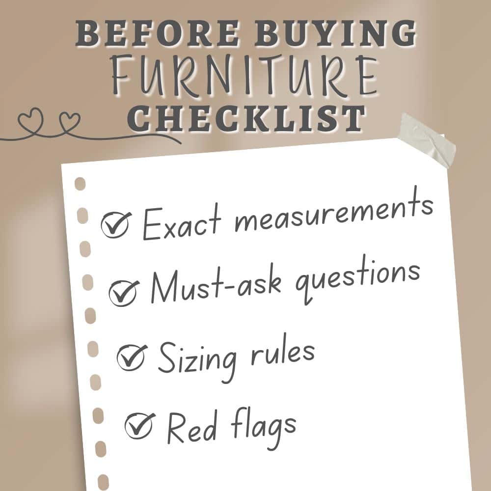
Before buying furniture, get this free checklist!
The measurements, sizing rules, and 10 must-ask questions that save you from returns, regrets, and wasted money.