Chartreuse Green Color Palette That Feels Grounded
This chartreuse green color palette shares hex codes and Benjamin Moore paint colors for the home that feel grounded and unique.
I’ve always loved green, but chartreuse can sometimes be difficult to pull off in the home. However, when paired with soft neutrals and earthy browns like those in this color palette, it can look amazing. I put this palette together to show how you can use a unique color without your home feeling loud or trendy.
Have you ever wondered what your home decor style is?
The color hex codes and the Benjamin Moore paint color matches are included below to make it easy to bring this look to life in your own home.
You can save any of these images to your Pinterest account using the Pinterest share buttons on this page to easily find them again later!
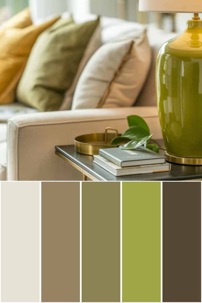
Chartreuse Green Color Palette
First, let’s talk about what interior design style works well with this color palette and how to implement these colors in your home. Then, we’ll go over the matching hex codes and paint colors.

What Design Style Works Well With This Palette?
This chartreuse green color palette works especially well in modern traditional, organic modern, and casual transitional homes.
The soft cream of Etiquette keeps everything light, while Free Spirit and Otter Brown add that grounded, comforting feel so many of us want.
Chopped Dill and Huntington Green bring in layers of green that feel natural instead of bold. Together, these colors create an interior design color scheme that feels thoughtful, relaxed, and pulled together.
How to Implement These Colors In Your Home
If you’re new to shades of chartreuse green, start with accents like lamps, pillows, or artwork in Huntington Green or Chopped Dill.
Use Etiquette on walls or larger pieces to keep the space feeling open and calm. Free Spirit and Otter Brown are perfect for furniture, rugs, or wood tones to warm things up.
Repeating each color palette shade throughout the room helps the color scheme feel intentional instead of scattered.
Chartreuse Green Color Palette Hex Codes

Color hex codes are hexadecimal representations of colors used primarily in web design and digital graphics.
They consist of six characters, ranging from 0 to 9 and A to F, representing the intensity of red, green, and blue (RGB) components, respectively.
Hex codes allow designers to specify colors precisely, ensuring consistency across various digital platforms and achieving the desired aesthetic.
These codes can be used in HTML, CSS, and graphic design software, providing a universal language for color communication in the digital realm.
The hex codes for this color palette are:
- #e5e1d4
- #968363
- #8a8253
- #9fa544
- #564934
Benjamin Moore Paint Colors

If you love these colors and want to use any of them as paint colors in your home, I have included the Benjamin Moore paint color matches.
On the Benjamin Moore website, you can order samples of their paint colors in a half-pint size, a 4″x8″ color swatch, or as a peel-and-stick paint sample. On the Samplize website, you can order full 8.5″x11″ peel-and-stick paint samples.
The Benjamin Moore paint colors for this palette are:
- Etiquette
- Free Spirit
- Chopped Dill
- Huntington Green
- Otter Brown
This is an affiliate link.
Similar Posts You’ll want to see
Conclusion
This chartreuse green color palette shows how bold color can still feel cozy and comfortable.
I love how these shades work together without competing for attention. With the right paint colors and supporting tones, chartreuse green becomes surprisingly easy to use throughout the home.
This color scheme works just as well in one room as it does as a whole house color palette. It’s proof that green can feel fresh, calm, and timeless all at once.
PIN IT TO REMEMBER IT
Don’t forget to pin this so you can refer back to it later!


Before buying furniture, get this free checklist!
The measurements, sizing rules, and 10 must-ask questions that save you from returns, regrets, and wasted money.