Minimalist Color Palette
This post is all about my minimalist color palette! My inspiration for this color scheme came from a photo of decorative vases in various neutral colors. In this post, I will go over some of the benefits of minimalist colors and tips for incorporating them, and then I will provide the color hex codes and the Sherwin-Williams paint color matches.

Minimalist Color Scheme
The guiding principle in crafting this minimalist color palette was simplicity intertwined with sophistication. Each color was chosen to evoke a sense of understated elegance while maintaining a clean and uncluttered aesthetic. Using minimalism in color selection aims to create spaces and designs that feel refined, timeless, and effortlessly chic.
Have you ever wondered what your home decor style is?
One of the most significant advantages of a minimalist color palette is its versatility. The simplicity of the hues allows them to seamlessly integrate into a myriad of design projects, ranging from interior décor to graphic design and beyond. Whether used as a foundation or as accents, these minimalist colors provide a versatile canvas for endless creative exploration, adapting effortlessly to diverse styles and themes.
A minimalist color palette elicits a mood and atmosphere of tranquility, clarity, and harmony. The subdued tones invoke a sense of calmness and serenity, fostering spaces free from visual clutter and distractions. This tranquil ambiance promotes relaxation, focus, and mindfulness, making it ideal for creating sanctuaries of peace and contemplation.
When incorporating this minimalist color palette into design projects, consider the importance of balance and restraint. Embrace negative space to strengthen the impact of the chosen hues, allowing them to breathe and command attention. Experiment with texture to add depth and interest while adhering to the minimalist ethos of simplicity and restraint. By adhering to these principles, you can create visually striking and harmoniously balanced designs.

Minimalist Color Palette Hex Codes
Color hex codes are hexadecimal representations of colors used primarily in web design and digital graphics. They consist of six characters, ranging from 0 to 9 and A to F, representing the intensity of red, green, and blue (RGB) components, respectively.
Hex codes allow designers to specify colors precisely, ensuring consistency across various digital platforms and achieving the desired aesthetic. These codes can be used in HTML, CSS, and graphic design software, providing a universal language for color communication in the digital realm.
The hex codes for this color palette are:
- #C8BFB8
- #AF9D8E
- #BFB2A8
- #CBCDCC
- #74523B
Minimalist Colors Sherwin-Williams
If you love these colors and want to use any of them as paint colors in your home, I have included the paint color matches from Sherwin-Williams. On the Sherwin-Williams website, some of their paint colors are available to order as color samples in either an 8″ x 8″ peel-and-stick or a 2″ x 3″ color chip. If the sample is not available in the color you want, you may be able to get a sample from Lowe’s.
The Sherwin-Williams paint color matches for this minimalist palette are:
- SW 0054 / Twilight Gray
- SW 7633 / Taupe Tone
- SW 6037 / Temperate Taupe
- SW 7064 / Passive
- SW 9099 / Saddle Up
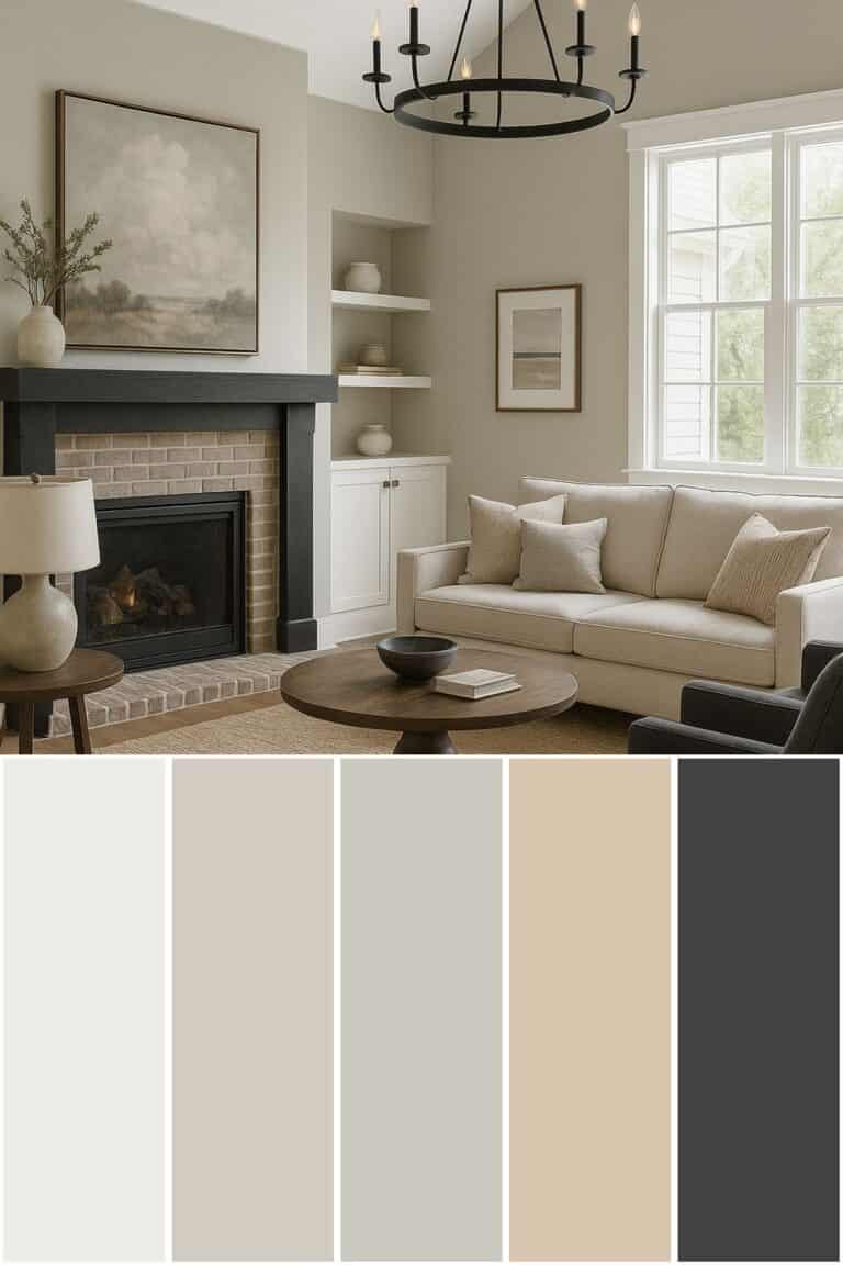
Minimalist Living Room Idea
If you want to use this minimalist color palette in your living room, here are some ideas for incorporating each color.
Start with a white or cream-colored
Layer decorative pillows symmetrically on either end of the
Choose beige linen curtains layered with white sheer curtains underneath. Layering curtains allows you to create a beautiful and versatile look that adds depth and style. If you don’t know how to layer curtains, I have a blog post covering all the tips and tricks to layer curtains effectively.
Next, use a natural wood coffee table. Natural wood brings warmth, texture, and a sense of organic beauty to minimalist living rooms, enhancing their aesthetic appeal while promoting a connection to nature and simplicity. If possible, find matching side tables to use on either side of the
Use a minimalist approach when styling the coffee table. Incorporate grey or taupe vases of varying heights placed on top of a simple tray.
Finally, use an area rug with a simple pattern that includes cream, grey, taupe, or light brown hues. This will help tie the room together.
Conclusion
This post was all about my minimalist color palette. This color scheme combines beige, gray, and terracotta shades and is inspired by the beautiful arrangement of neutral-colored vases on top of a white table. Neutral colors make wonderful minimalist color palettes and are incredibly versatile. This palette can be used in a living room, bedroom, or any room in the house!
Before you go, be sure to check out my other color palettes.


Before buying furniture, get this free checklist!
The measurements, sizing rules, and 10 must-ask questions that save you from returns, regrets, and wasted money.