Moody Color Palette
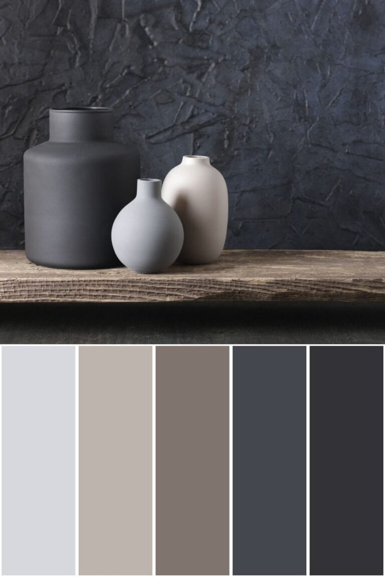
This post is all about my moody color palette! My inspiration for this color scheme came from a photo of a black and grey vase set in a moody living room. In this post, I will give a little bit of background information on moody tone colors, and then I will provide the color hex codes as well as the Sherwin-Williams paint color matches.

Moody Color Scheme
Before we discuss each color, I want to provide some background information about moody colors. Specifically, I will summarize moody tone colors and where to use a moody color palette.
Have you ever wondered what your home decor style is?
What are moody tone colors?
Moody tone colors refer to hues that evoke a sense of depth, drama, and emotion. These colors often have a darker, more muted appearance, conveying a sense of mystery, melancholy, or intensity. Moody tones can include deep blues, rich purples, dark greens, and smoky grays. They are frequently used in interior design, photography, and fashion to captivate and engage the viewer’s emotions.
A moody color scheme offers several benefits in various contexts. Moody colors can evoke strong emotions and create a specific atmosphere. Depending on the hues used, they can convey feelings of mystery, drama, intimacy, or nostalgia.
Darker, richer colors in a moody palette can add depth and sophistication to a space or design. They can create a sense of luxury and elegance, making a room or composition feel more refined and visually interesting. While moody colors are often associated with darker hues, they can be versatile and adaptable to different styles and themes. Moody palettes can be combined with contrasting elements or bright accents to create dynamic visual compositions that stand out.
Where should you use a moody color palette?
A moody color palette can be effectively used in various areas of the home to create specific atmospheres and evoke particular emotions. Here are some suggestions for where to use a moody color palette:
- Living Room: Use moody colors to create a cozy and intimate atmosphere. Deep blues, rich purples, and dark greens can add a sense of drama and sophistication to the space, making it feel inviting and luxurious.
- Bedroom: Moody colors are ideal for the bedroom, where you want to create a relaxing and tranquil environment. Dark neutrals like charcoal gray or deep navy can help promote rest and relaxation while still adding elegance to the space.
- Home Office: Moody colors in a home office or study is a classic design choice. Darker hues like deep burgundy or forest green can create a sense of warmth and coziness.
- Dining Room: Moody colors can add a sense of drama and sophistication to the dining room, making it feel like a special and intimate space for entertaining guests. Use rich jewel tones or dark shades of blue or purple to create a stylish and inviting atmosphere.
- Accent Walls: If you’re hesitant to paint an entire room in moody colors, consider using them as accent walls instead. A single wall painted in a deep, dramatic hue can add visual interest and create a focal point in any room without overwhelming the space.
Overall, incorporating a moody color palette into your home decor can add depth, warmth, and personality to your living spaces, creating a stylish and inviting atmosphere that reflects your unique taste and style.

Moody Color Palette Hex Codes
Color hex codes are hexadecimal representations of colors used primarily in web design and digital graphics. They consist of six characters, ranging from 0 to 9 and A to F, representing the intensity of red, green, and blue (RGB) components, respectively.
Hex codes allow designers to specify colors precisely, ensuring consistency across various digital platforms and achieving the desired aesthetic. These codes can be used in HTML, CSS, and graphic design software, providing a universal language for color communication in the digital realm.
The hex codes for this color palette are:
- #111B23
- #F8F7F7
- #46484B
- #C2BAB5
- #8E817C
Moody Colors Sherwin-Williams
If you love these colors and want to use any of them as paint colors in your home, I have included the paint color matches from Sherwin-Williams. On the Sherwin-Williams website, some of their paint colors are available to order as color samples in either an 8″ x 8″ peel and stick or a 2″ x 3″ color chip. If the sample is not available in the color you want, you may be able to get a sample from Lowe’s.
The Sherwin-Williams paint color matches for this moody palette are:
- SW 6237 / Dark Night
- SW 7757 / High Reflective White
- SW 7076 / Cyberspace
- SW 9567 / Viaduct
- SW 9579 / Timeless Taupe
Moody Living Room Idea
If you want to use this moody color palette in your living room, here are some ideas for how to incorporate each color.
Start with a dark-colored couch, such as black or charcoal. This will set the tone for your moody living room and will be a versatile furniture piece that can match various decor styles.
Choose a coffee table and side tables with a dark wood finish. This is a way to incorporate some of the darker brown colors from the color palette, providing warmth and coziness to the room.
Look for an area rug with predominantly brown and taupe colors and hints of cream colors. Ideally, the rug should have a little bit of every color throughout the rug. Area rugs can really pull a room together and make it feel cohesive and intentional.
Use a cream-colored chunky knit throw blanket to brighten up the space just a bit and to add an additional texture to the room. Pair the blanket with brown, taupe, and beige decorative throw pillows with various patterns.
Finally, get a black or charcoal tray to place atop the coffee table and style it with various table decor items such as a grey vase set and a stack of decorative books.
Conclusion
This post was all about my moody color palette. This color scheme combines shades of black, cream, and brown inspired by the beautiful living room photograph featuring a vase set on top of a coffee table in front of a black couch. Seeing as this palette was inspired by a living room photo, these moody colors would look great in a living room as well as in a bedroom or office design.
Before you go, be sure to check out some of my other color palettes.


Before buying furniture, get this free checklist!
The measurements, sizing rules, and 10 must-ask questions that save you from returns, regrets, and wasted money.