Warm Color Palette
This post is all about my warm color palette! My inspiration for this warm burnt orange color scheme came from a photo of a bedroom with cream color bedding, burnt orange pampas grass, natural wood tones, and macrame wall hangings. The palette features colors ranging from cream and burnt orange to terra cotta. In this post, I will give some background information on warm-tone colors, and then I will provide the color hex codes and the Sherwin-Williams paint color matches.

Warm Color Scheme
Warm color schemes are a versatile and inviting choice for home decor, evoking feelings of coziness, comfort, and intimacy. Warm colors are those that remind us of heat, sunlight, and fire, such as reds, oranges, yellows, and browns. These hues are known for their ability to create a sense of warmth and energy in a space, making them perfect for infusing rooms with a welcoming atmosphere.
Have you ever wondered what your home decor style is?
In home decor, warm colors can be used in various ways to enhance the atmosphere of a room. For example, painting walls in warm tones like terra cotta or burnt orange can instantly add depth and richness to a space, while incorporating warm-colored accents such as throw pillows, rugs, or artwork can inject pops of color and visual interest. Additionally, natural materials like wood or rattan furniture can further enhance the warmth of a room, adding texture and depth to the overall design.
Warm color schemes are particularly well-suited for areas where comfort and relaxation are key, such as living rooms, bedrooms, or cozy reading nooks. By strategically incorporating warm hues into your home decor, you can create inviting and harmonious spaces that beckon you to unwind and linger awhile. Whether you opt for a bold and vibrant palette or a more subdued and earthy scheme, warm colors have the power to transform your home into a sanctuary of comfort and style.

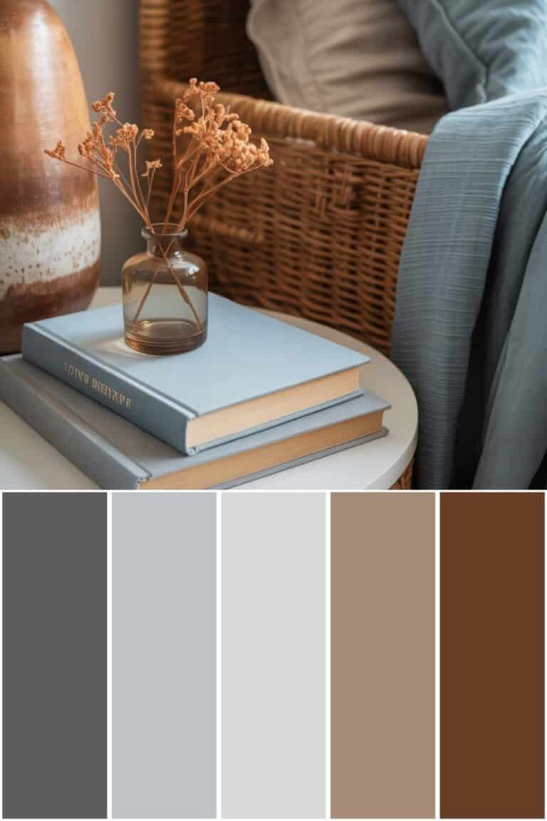
Warm Color Palette Hex Codes
Color hex codes are hexadecimal representations of colors used primarily in web design and digital graphics. They consist of six characters, ranging from 0 to 9 and A to F, representing the intensity of red, green, and blue (RGB) components, respectively.
Hex codes allow designers to specify colors precisely, ensuring consistency across various digital platforms and achieving the desired aesthetic. These codes can be used in HTML, CSS, and graphic design software, providing a universal language for color communication in the digital realm.
The hex codes for this color palette are:
- #EBE2E3
- #D8C1B8
- #F7F5F9
- #CDA184
- #925D3A
Warm Colors Sherwin-Williams
If you love these colors and want to use any of them as paint colors in your home, I have included the paint color matches from Sherwin-Williams. On the Sherwin-Williams website, some of their paint colors are available to order as color samples in either an 8″ x 8″ peel and stick or a 2″ x 3″ color chip. If the sample is not available in the color you want, you may be able to get a sample from Lowe’s.
The Sherwin-Williams paint color matches for this burnt orange palette are:
- SW 9691 / Crystalline
- SW 6022 / Breathless
- SW 7757 / High Reflective White
- SW 7720 / Deer Valley
- SW 2803 / Rookwood Terra Cotta
Warm Bedroom Idea
If you want to use this warm color palette in a bedroom design, here are some ideas for how to incorporate each color.
Choose a wood bed frame with a natural finish. A natural wood bed frame complements warm color schemes by adding warmth, depth, and harmony to the room’s aesthetic. Its rich tones and textures create a cozy and inviting ambiance while harmonizing effortlessly with warm hues like cream, burnt orange, and terra cotta. A wood bed frame also offers timeless elegance, versatility, and durability, making it a stylish and long-lasting investment for any bedroom.
For the bedding, start with a cream-colored bedding set. This neutral base allows you to layer various colors and textures to add depth and visual interest to the bed. Incorporate accent pillows and throw blankets in shades of burnt orange, terra cotta, and warm browns to complement the cream base and enhance the room’s cozy feel. Mix different textures like knits, linens, and faux furs to create a luxurious and inviting retreat.
Use a large jute area rug underneath the bed to add an element of natural texture and warmth to the space while also grounding the bed visually within the room. The jute rug’s earthy tones complement the warm color scheme and provide a cozy surface underfoot. Additionally, the rug helps define the sleeping area within the room, creating a sense of cohesion and balance in the design.
Incorporate decorative elements throughout the room, such as macrame wall hangings, earthy-toned vases with pampas grass stems, and woven baskets for storage. These elements add visual interest and texture to the room while complementing the warm color palette. Macrame wall hangings bring a bohemian flair, while earthy-toned vases with pampas grass stems add a touch of nature-inspired elegance. Woven baskets enhance the aesthetic and provide practical storage solutions, keeping the room tidy and organized.
Conclusion
This post was all about my warm color palette. This color scheme combines shades of cream, burnt orange, and terra cotta, inspired by the beautiful bedroom photograph featuring cream-colored bedding, dark orange pampas grass, and natural wood tones. These warm colors would look great in a living room and in a bedroom design.
Before you go, be sure to check out my other color palettes.


Before buying furniture, get this free checklist!
The measurements, sizing rules, and 10 must-ask questions that save you from returns, regrets, and wasted money.